

With the increasing dominance of mobile devices in online browsing, prioritizing making a website mobile-friendly for SEO is essential for any website. By optimizing your site’s responsiveness, you can create a seamless mobile experience, boost user engagement, and enhance your search engine visibility. Learn effective strategies to make your website mobile-friendly and stay ahead in the digital landscape.
What is Responsive Website Design?
Responsive website design refers to an approach that ensures a website’s layout and elements automatically adjust and adapt to different screen sizes and devices.
It allows the site to provide an optimal viewing experience, regardless of whether it is accessed on a desktop, laptop, tablet, or mobile phone. This flexibility in design ensures that users can easily navigate and interact with the website, regardless of the device they are using.
Significance of optimizing websites for Mobile Devices
Optimizing websites for mobile devices has become increasingly important in the digital landscape. Let’s explore each aspect in detail.
-
High Google Ranking:
With mobile usage surpassing desktop, search engines prioritize mobile-friendly websites in their rankings. By optimizing your site for mobile devices, you increase the chances of appearing higher in search results. This drives more organic traffic to your site and improves your visibility and online presence.
-
Excellent User Experience:
Mobile optimization ensures that visitors have a seamless and intuitive browsing experience on their mobile devices. Fast loading times, easy navigation, and content tailored for smaller screens enhance user engagement and satisfaction. By meeting these expectations, you increase conversions, retain visitors, and foster positive brand experiences.
-
Mobile-first Indexing:
Google’s shift to mobile-first indexing means that the mobile version of your website is given priority when it comes to ranking and indexing. If your site is not optimized for mobile, it may not be crawled and indexed correctly, leading to poor visibility in search results. Optimizing for mobile ensures that your content is accessible to search engine bots, improving your chances of ranking well.
-
Lower Bounce Rates:
A high bounce rate, where visitors leave your site after viewing only one page, can negatively impact your website’s performance. Non-responsive websites often frustrate users with slow loading times and difficult navigation on mobile devices, leading to quick exits. By optimizing your site for mobile, you create a smooth and engaging user experience that encourages visitors to explore further, ultimately reducing bounce rates and increasing conversions.
Here are the ways to make your website mobile Friendly
Making your website mobile-friendly is crucial for delivering an optimal user experience on mobile devices. Let’s explore effective ways to achieve this:
-
Use website responsive design:
Implement a design approach that automatically adjusts your website’s layout, images, and content to fit various screen sizes, ensuring an optimal user experience on mobile devices.

-
Optimizing page speed for mobile devices:
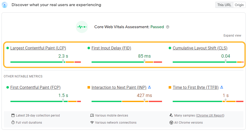
Mobile users expect fast-loading websites. Optimizing your website’s performance by minimizing file sizes, leveraging browser caching, and compressing images can significantly improve page speed on mobile devices, providing a smooth and enjoyable browsing experience. You use the Google page speed insights tool to check the page speed of your mobile version of the website and gain insights to improve the same.
-
Mobile-Friendly Content:
Ensure that your website’s content is easily readable and accessible on smaller screens. Use concise and engaging headlines, break up content into shorter paragraphs, and utilize bullet points or lists to enhance readability. Additionally, prioritize mobile-friendly formats such as responsive text and fluid layouts to adapt to different screen sizes.
-
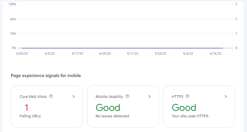
Test and monitor GSC for errors:
Regularly check Google Search Console for mobile-specific errors or issues like mobile usability errors, faulty redirects, or crawl issues, and fix them promptly to improve mobile friendliness and search visibility.
-
Creating a clear and intuitive navigation menu for mobile devices:
Mobile navigation should be simple and user-friendly. Implement a responsive menu that collapses into an easy-to-access icon or a slide-out menu, allowing visitors to navigate your website effortlessly on mobile devices.
-
Mobile-Friendly Images and Videos:
Optimize images and videos for mobile devices by compressing them without compromising quality. Use responsive design techniques to ensure that media elements adjust and scale properly on different screen sizes, preventing distortion or slow loading times.
-
Readable Fonts and Font Sizes:
Select fonts that are legible on smaller screens and ensure that font sizes are large enough for easy reading without zooming. Avoid using complex or decorative fonts that may become difficult to decipher on mobile devices.
-
Optimized Content Layout:
Arrange your content in a mobile-friendly layout that is easy to scan and digest. Use white space effectively to create a clean and uncluttered appearance, and consider utilizing collapsible sections or accordions to present lengthy content in a more condensed format.
-
Avoid pop-ups:
Minimize or eliminate intrusive pop-ups on mobile devices as they can disrupt user experience, cause frustration, and potentially affect search engine rankings. Utilize alternative methods such as banners or inline content for important messages.
-
Space out links:
Ensure links and buttons have adequate spacing between them to prevent accidental clicks and improve touch ability on mobile devices, reducing user frustration and enhancing overall usability.
Conclusion
Ensuring that your website is mobile-friendly is essential in the era of digital dominance. By employing effective strategies, you can create a smooth mobile experience for your users. Teaming up with 1702 Digital for website development services empowers you to conquer the challenges of mobile optimization and stay ahead of the competition in the fast-paced digital landscape. Embrace mobile-friendliness, elevate user satisfaction, and position your brand as a leader in the ever-evolving digital realm with the guidance of 1702 Digital.