
Responsive Web Design: What It Is, Benefits, Best Practices & How to Make Your Website Mobile-Friendly
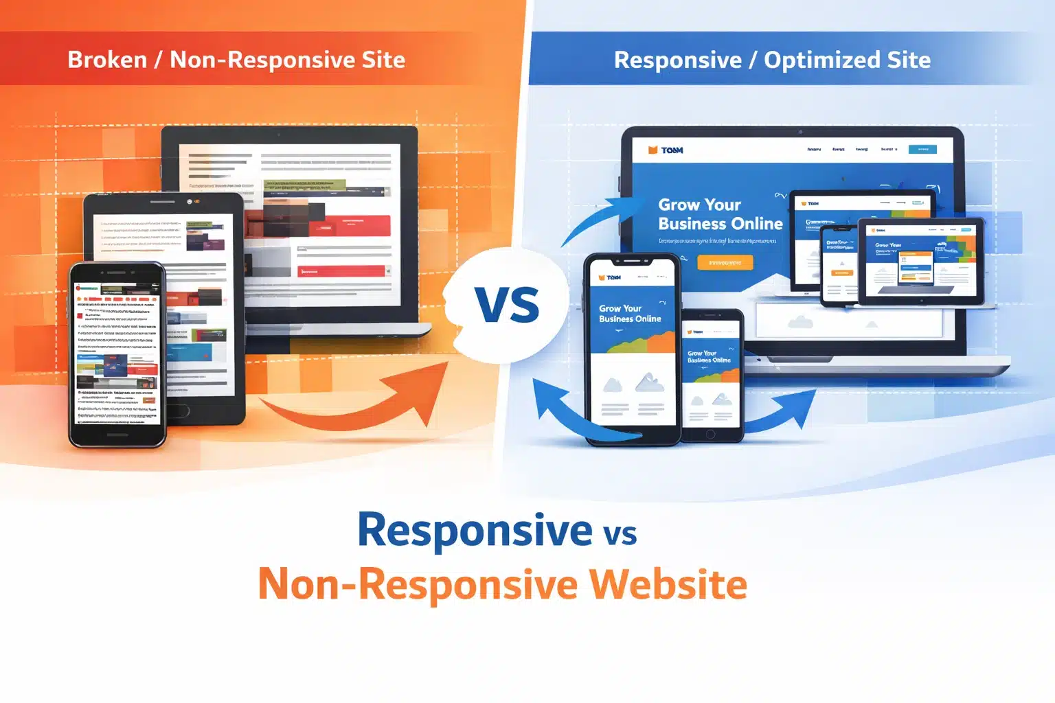
Table of Contents
Summary
People use a range of devices to access web pages, so making websites adaptable to these devices and intuitive to use has become essential. In this article, we are going to talk about:
- What is responsive design, and how does it function
- Main advantages of converting to responsive web development
- Steps on how to make a site responsive
- Essentials of responsive web development
A potential customer learns about your company and then visits your website. What they see is a complete mess: the layout is all over the place, the text is tiny, and the buttons are so small that you can’t even tap them with your finger. And just like that, they leave! This one incident, which you have no control over, could cost you a lead, a sale, or a loyal customer.
Unfortunately, many people experience this every day, and it is avoidable. The solution is responsive web design. It ensures your website is visually appealing and user-friendly on all devices, from a 4-inch smartphone to a 32-inch desktop monitor.
In this blog, we explain what responsive web design is, the measurable benefits, best practices and how to make a site responsive.
What Is Responsive Web Design?
Responsive Web Design (RWD) is a development methodology that delivers different versions to users across devices and screen sizes by automatically adapting layout, images, and even content. Instead of creating two separate sites for desktop and mobile, the responsive site uses techniques such as flexible grids, images, and CSS media queries to automatically adapt to different devices.
Responsive design is a way to answer the following question: how can the same content be adapted so that it effectively meets users’ needs regardless of their device? The best way is to rely on three basic elements:
- Fluid Grids: These are layout arrangements based on proportional units (e.g., percentages) rather than fixed pixels, so their dimensions naturally adjust with the viewport size.
- Flexible Images: These are images that get resized along with the elements they are contained in to avoid overflow or getting stretched.
- CSS Media Queries: different sets of styles can be applied to different screen sizes; for example, a three-column layout can be changed into a single-column view on mobile devices.
Responsive design ensures your website displays correctly and functions flawlessly on any device, whether a phone, tablet, or desktop. Among internet users worldwide, 93.7% prefer to go online on their mobile phones, compared with around 60% who use laptops, so the website must present a consistent appearance across all devices.
Key Benefits of Responsive Design
1. Broader Audience Reach
The largest portion of your target market is already on the go with their mobile devices. A website that doesn’t work on such devices is half-baked for the majority of your visitors. Implementing responsive design ensures that the website does not shut out potential customers.
2. Enhancement of Search Engine Results
Google has now adopted mobile-first indexing, which means it will prioritise the mobile version of your website for ranking. For those deeply committed to SEO, learning to make a site responsive is no longer optional; it is now a prerequisite for visibility.
3. Lower Maintenance Costs
Running a mobile site separately from a desktop one means doubling your efforts. Each time you update content, fix bugs, or modify designs, you have to do it twice. A responsive design merges everything into a single codebase, thereby drastically reducing ongoing maintenance resources for both in-house teams and responsive web development services.
4. Increased User Experience and Engagement
A consistent, smooth experience across all devices, especially in visual elements and interactions, is a trust factor. Visitors who find your website easy to use on any device are not only going to stay longer but also check out more pages and convert. On the other hand, a poor mobile experience leads to higher bounce rates and shorter dwell time, both of which are metrics search engines use to determine a site’s quality.
5. Future-Proofing Your Website
The market is seeing more device types, such as foldable phones, smartwatches, and large ultra-wide monitors. A properly developed responsive website accommodates these devices without requiring a total overhaul. Making a responsive site means that, going forward, your website remains usable and visually attractive even as new technologies are introduced.
Responsive Web Development Best Practices
We know “why” you should have a responsive website. Here is the “how”, the responsive web development best practices that distinguish well-made sites from problematic ones:
1. Make a Mobile-First Design
Don’t think of desktop design first and then try to fit it on smaller devices; do the opposite, start with the smallest screen and grow it to the largest. This helps you keep things clean and neat and have well-ordered, clearly prioritised content. It is also the method Google recommends for creating a responsive website that can achieve high rankings.
2. Use Relative Units Everywhere
Instead of using fixed pixel values, you should use relative units, e.g., em, rem, vw (viewport width), and vh (viewport height). Doing so ensures your fonts, spacing, and layout components scale without being cut off or becoming too small across different devices.
3. Define Thoughtful Breakpoints
The breakpoints you choose should be based primarily on your content rather than specific device sizes. As you resize the viewport, observe how your design responds and add media queries where your layout starts to fail. Don’t rely solely on a list of popular device sizes, as they change frequently.
4. Optimise Images for Every Screen
Large images are one of the biggest causes of slow loading on mobile devices. Use the HTML srcset attribute to provide different image sizes for different screen resolutions. Besides that, you can also experiment with modern image formats, such as WebP, which offers better compression without degrading quality.
5. Keep Touch Targets Accessible
Buttons and links, the interactive elements on touchscreen devices, must be sufficiently large and spaced out to enable accurate tapping. Google recommends a touch target size of at least 48 x 48 pixels.
6. Test Across Real Devices
Although browser developer tools help to a large extent, nothing comes close to testing on actual devices. For example, you may find considerable differences between Android and iOS in the way the fonts are rendered, scroll behaviour, and input handling. One option could be to keep a few testing devices or make use of a remote testing platform.
7. Prioritise Performance
Responsiveness and performance complement each other. It is not enough for a layout to reflow well on a small screen if it takes 8 seconds to load; this will most definitely lead to user attrition. Render-blocking resources should be minimised, browser caching should be leveraged, and a content delivery network (CDN) should be used as part of your responsive web development best practices checklist.
How to Make Your Site Responsive?
If you already have a site and are thinking about how to make it responsive, here is a practical starting framework:
- Use Google’s Mobile-Friendly Test tool to check your current website and identify the exact computer errors.
- Add the viewport meta tag to your website code if it is not already present. Without this tag, mobile browsers will treat your website as if it were meant for desktops only.
- Then, change any fixed-width containers to max-width ones and base the widths on percentages instead.
- Set the CSS media queries at the main breakpoints (most commonly 480px, 768px, and 1024px) as initial reference points.
- Next, use CSS Flexbox or CSS Grid to replace those old layout types that were fixed and did not allow element reordering in responsive designs.
- Lastly, make a list of all your pictures and either include srcset attributes for them or simply use CSS’s max-width.
However, if the project is larger and/or more complex, hiring a professional responsive web development service may be the faster option, especially if you want a complete design transformation.
Conclusion:
Responsive web design is no longer just a design trend; it is a business necessity. From improving user experience and boosting SEO rankings to reducing maintenance costs and future-proofing your website, the benefits are undeniable. A responsive website ensures that every visitor, regardless of device, gets a seamless and engaging experience.
However, implementing responsive design effectively requires a deep understanding of UX, performance optimisation, and modern development frameworks. This is where 1702 Digital can make a real difference.
As a performance-driven digital marketing and web development agency, 1702 Digital helps brands:
- Build fully responsive, high-performing websites
- Optimise for mobile-first indexing and Core Web Vitals
- Improve user experience to increase conversions
- Implement scalable design systems for future growth
Whether you’re revamping an existing website or building one from scratch, partnering with 1702 Digital ensures your website is not just responsive but also fast, SEO-friendly, and conversion-focused.
Frequently Asked Questions (FAQs)
Q1: What is the difference between responsive design and adaptive design?
Responsive design relies on fluid grids and CSS media queries that continuously adapt the layout to the viewport and the size of the viewing device. On the other hand, an adaptive design consists of several fixed layouts created for specific screen sizes. Responsive design is more versatile and simpler to support.
Q2: Is responsive design the same as mobile-friendly design?
No, there is a difference. The website can be “mobile-friendly”, but it does not have to be responsive. For example, the site is basic and is just shown to mobile users. Responsive design is a more in-depth approach that ensures the site functions well across screen sizes, thereby not limiting it to mobile users.
Q3: How long does it take to make a website responsive?
The time depends on how complex the website’s code is. For a small site with a few pages, it might only take a few days. For a content-heavy site with complex layouts, it may take weeks to complete the work.
Q4: Does a responsive website perform better in SEO?
Yes! Google uses mobile-first indexing, which prioritises websites that work well on mobile devices and are responsive. Websites that are hard to use on mobile devices, e.g., small text, poor layout, or slow loading, might be ranked lower than well-optimised responsive sites.
Like What You Read?
Have an Idea and Want to Build Something Together? Contact Us Now